
The world of design is a kaleidoscope of colors, each palette carefully chosen to evoke emotions, establish brand identities, and guide the viewer’s experience. But sometimes, stepping away from the spectrum and embracing a more limited color scheme can yield stunning and impactful results. Enter duotones and color filtering: modern twists on color that add depth, drama, and a touch of vintage charm to contemporary design.
The Power of Two: Unveiling Duotones
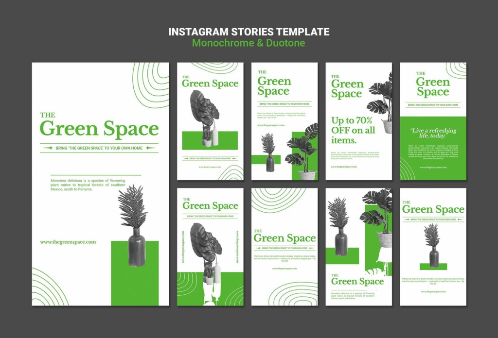
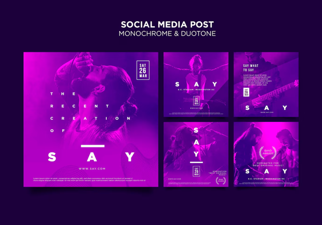
Duotones are graphic design powerhouses. They use two contrasting colors to replace the grayscale tones of an image, creating a visually striking effect. Imagine a black and white photograph where the shadows are replaced with a deep, moody blue, and the highlights come alive with a warm, sun-kissed yellow. This creates a sense of depth and dimension, while the limited color palette imbues the image with a timeless elegance.
Duotones are incredibly versatile. They can be used to:
- Create a Retro Vibe: Embrace a nostalgic aesthetic with a sepia-toned duotone, reminiscent of vintage postcards or film photographs.
- Make Bold Statements: Juxtapose contrasting colors like a fiery red and a cool teal to grab attention and create a sense of drama.
- Enhance Brand Identity: Use brand colors in a duotone to create a visually cohesive design that reinforces brand recognition.
The Art of Color Filtering: A Wash of Creative Control
Color filtering goes beyond a simple duotone. It involves applying a translucent layer of color over an image, subtly shifting its overall hue while preserving details. Imagine a photograph bathed in a soft pink filter, adding a touch of whimsy and romance.
Color Filtering Finesse
- Mood Magic: Use cool filters like blues and greens to evoke feelings of calmness and serenity. Warm filters like yellows and oranges can create a sense of warmth and energy.
- Selective Color Play: Isolating specific colors within an image and manipulating their hue allows for creative color play, drawing attention to certain elements.
Duotones and Color Filtering: The Perfect Blend
The beauty lies in combining these techniques. Apply a color filter to an image, then use a duotone effect on top. This creates a layered and visually captivating composition.
Beyond the Screen: A World of Applications
Duotones and color filtering aren’t restricted to the digital realm. They can be used in print design, packaging, and even web design to create a unique and cohesive visual identity across all platforms.
The world of color is your playground! Don’t be afraid to experiment with different duotone combinations and color filters. The key is to find a balance that complements your design goals and resonates with your audience. So, ditch the predictable color palettes and dive into the world of duotones and color filtering. You might just discover a new favorite way to express yourself visually.