Thinking of building a brand for a new business? Well, it is more than just designing a logo or choosing a color scheme. There are other major components to consider like brand identity, personality, brand mission, and communication. As a graphic designer, your task will be to understand and implement the essentials & transform them into design elements. Your work must communicate with the target audience & delegate your key message properly. Let’s explore what to consider for these key components.
Logo Design: The Heart of Brand Identity
A logo is the brand’s first interaction with the audience in most cases. That’s why, to make a place in the audience’s mind, it should be memorable, scalable, and at the same time, it should reflect the brand’s ethos. While you are designing a brand logo, you have to make sure it’s unique, simple, identifiable, & memorable. A well-designed logo is not all about complexity. Rather, it tries to be memorable in simpler ways. So the quick suggestion is, don’t just put everything in this world into a logo. Keep it simple, color-oriented, & eye-soothing.
Color Palette: Communicating Through Colors
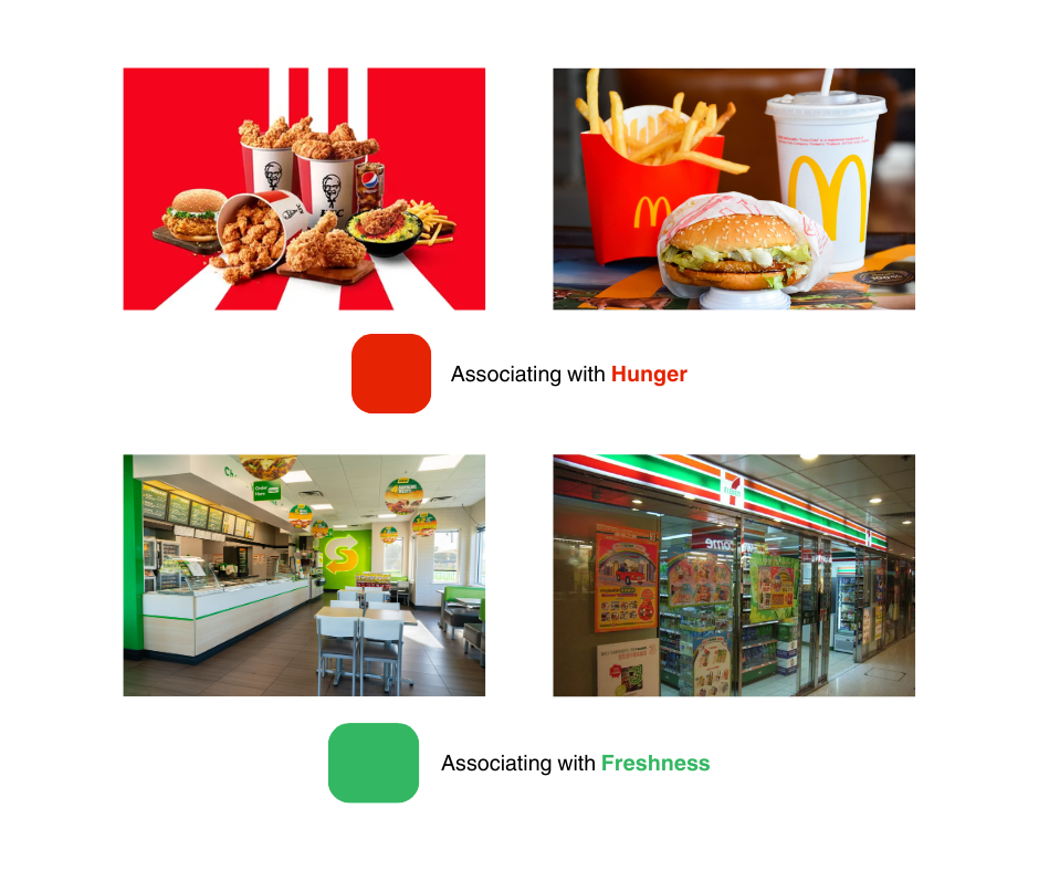
Choosing the right color is very crucial because it helps the audience to find your brand from the crowd. Also, your color has to associate with your product & message you want to convey. Choosing the right color palette for brand identity involves understanding color psychology and how different hues can influence perception and behavior. For example, if you follow the fast-food chains around the world, you’ll see red everywhere. KFC, Pizza Hut, McDonald’s, Domino’s everywhere you’ll see red as a primary or secondary color. It’s mostly because red subconsciously associates with hunger. On the other hand, brands who want to associate with fresh foods like Subway or Seven Eleven use green as their primary color. You see how color plays the role here, right? That’s why instead of just putting whatever color you like in the logo, do proper research & select color according to your message.

Typography: The Voice of Your Brand
Fonts can tell who you are without even making any sound. Just look at the two examples below.


Is it difficult to say which brand is providing which kind of value? Fonts tell about your identity, your value, & your elegance. Choosing comic sans (just because you like it) in a serious business won’t provide much of a value. Bold & tower fonts help you provide a strong message, whereas Serif fonts are mostly used for elegant branding. That’s why consistency in typography is essential to reinforce the brand’s identity and aids in building recognition.
Visual Storytelling
Custom imagery and graphics add depth to a brand’s narrative, allowing for a richer storytelling experience. Whether through photography, illustrations, or abstract art, these visual elements should complement the brand’s overall aesthetic and message, providing a cohesive look and feel across all platforms. From the following example, you can already tell which brand it is without even looking at the brand name. That’s how strong visual storytelling is.

Brand Guidelines: The Blueprint for Consistency
Brand guidelines, or a brand style guide, are the rulebook for how all elements of the brand are applied. It covers logo usage, color palette, typography, imagery, and more, ensuring consistency across all brand touchpoints. Consistency strengthens brand identity, making it easily recognizable and reliable in the eyes of the audience. Like, you’ll never see established brands putting their logo here and there every time. Even for simple banners or social media posts, they have allocated locations to put their logo. This helps to make your presence more visible & unique.
As a graphic designer, your job will be to deliver the core brand message & the story with visual elements. The process will definitely be challenging when you are making something unique & involves strategic thinking. But in doing so, you lay the foundation for a brand’s visual communication, fostering recognition, loyalty, and growth.

