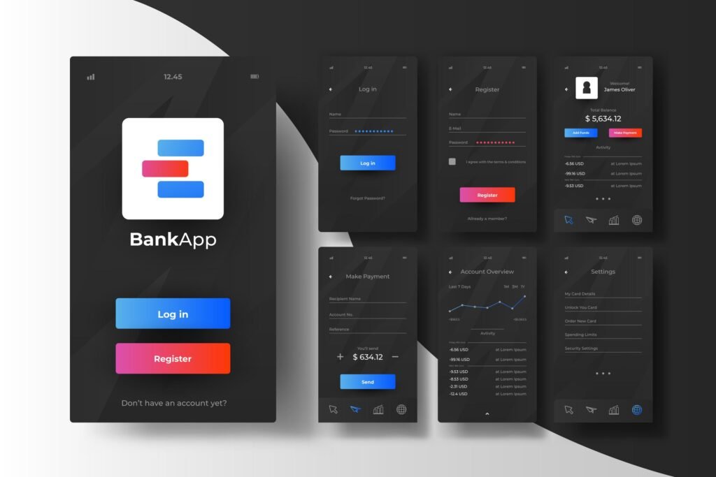
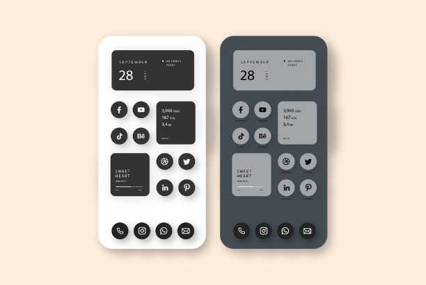
In recent years, the inclusion of dark mode in software, applications, and web design has transitioned from a mere trend to a fundamental feature that users expect. This design choice, characterized by light text on a dark background, is not only a matter of aesthetic preference but also brings several functional benefits. Here’s a closer look at why dark mode has become a popular choice among designers and users alike.

Aesthetic Appeal
Dark mode offers a sleek and modern look that many users find visually appealing. It provides a dramatic contrast that can make design elements pop, enhancing the visual hierarchy of the layout. This mode can also give a feeling of depth and sophistication, transforming the user interface into a visually engaging experience.
Reduces Eye Strain
One of the most significant functional benefits of dark mode is its potential to reduce eye strain, particularly in low-light conditions. Bright screens emit a considerable amount of blue light, which can be harsh on the eyes, leading to discomfort and fatigue. Dark mode limits the amount of light emitted, offering a more comfortable viewing experience that can reduce eye strain and potentially improve sleep quality for users who interact with screens before bedtime.
Energy Efficiency
On devices with OLED or AMOLED screens, dark mode can contribute to energy savings. These screen technologies turn off black pixels, meaning that displaying darker interfaces requires less power. Consequently, using dark mode can extend battery life on mobile devices, a practical advantage for users who rely on their gadgets throughout the day.
Improves Focus and Concentration
The reduced glare from dark mode interfaces can help improve focus and concentration. The darker background minimizes distractions, allowing users to concentrate on the content more effectively. This can be particularly beneficial for reading or working on tasks that require sustained attention.
Accessibility
Dark mode can also play a crucial role in accessibility. For users with certain visual impairments or sensitivities, such as photophobia (light sensitivity), a dark interface can make the experience of using a device or browsing the web more accessible and less painful. Offering dark mode as an option can therefore enhance the inclusivity of digital products.
Implementing Dark Mode
While dark mode offers several benefits, it’s important for designers to implement it thoughtfully. Not all content is automatically more readable or aesthetically pleasing in dark mode. Designers must adjust colors, contrast ratios, and opacity to ensure readability and visual comfort. Testing designs in both light and dark modes is crucial to provide a seamless user experience regardless of the user’s preference.
When to Avoid Dark Mode
While dark mode is great for many reasons, it’s important to remember it has some downsides too. For instance, dark colors sometimes make people think of sad things, like mourning or feeling down. Also, if you use dark mode in a very bright place, it might make your eyes tired. People with certain eye conditions, like nearsightedness or astigmatism, might find it hard to read text because it appears blurred. Some folks might even find it harder to understand what they’re reading or to stay focused in dark mode. Plus, it’s good to know that dark mode doesn’t always save battery life, especially on older devices that don’t have the latest screen technology.
Dark mode is more than just a stylish design trend; it offers aesthetic and functional benefits that enhance the user experience. By reducing eye strain, saving battery life, improving focus, and accommodating accessibility needs, dark mode has established itself as an essential feature in modern digital design. As technology continues to evolve, the importance of offering user-friendly design options like dark mode will only increase, ensuring that digital environments are accessible, comfortable, and enjoyable for all users.

