Alright, design squad, listen up! We all know data can be drier than a week-old everything bagel. Numbers, statistics – enough to put anyone to sleep faster than counting sheep. But fear not, because we have the power to transform this yawn-fest into something epic: infographics!
Think of them as the superheroes of information. They take dull data and inject it with a shot of visual adrenaline, making it clear, engaging, and downright shareable. But here’s the thing, just throwing data on a page isn’t going to win any awards. We gotta make it sing, make it dance, make people stop scrolling and say, “Whoa, that’s cool!”
First things first: who are you designing this infographic for? Tech wizards or meme-loving millennials? Knowing your audience is key. It’ll influence your design choices and ensure your infographic speaks their language.
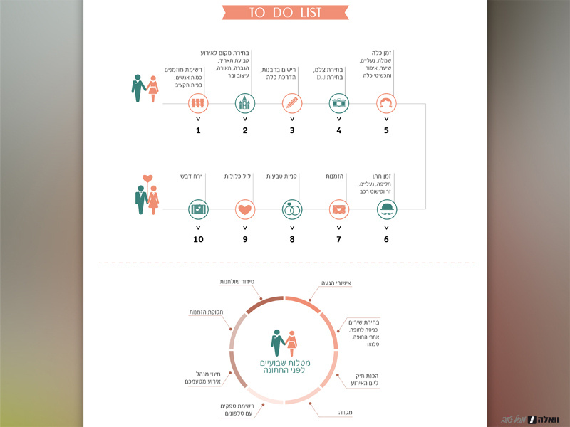
Next, remember, infographics are all about delivering info in a bite-sized, easy-to-swallow way. Don’t drown people in text! Focus on the key takeaways and keep it short and sweet. Bullet points, punchy sentences, and visuals are your best friends here. Text overload is the enemy – we don’t want people running for the hills!
But infographics aren’t just about data, they’re about stories! Use a narrative to guide your audience through the information. Think problem, solution, and BAM! Data that proves your point. A good story keeps people hooked and invested in what you’re showing them.
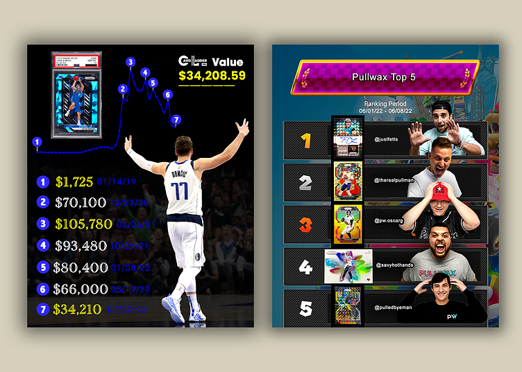
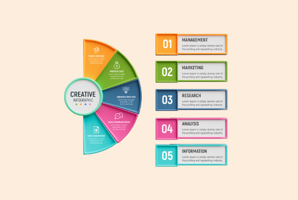
Now, let’s talk about the fun stuff: visuals! Because let’s be honest, a text-heavy infographic is the design equivalent of watching paint dry. Charts, graphs, icons – these are your weapons of mass engagement! They break up the text and make everything way more interesting to look at. Remember, people process visuals faster than text, so make sure your pictures are clear, well-designed, and tell the data’s story in a way that pops.
Color is another superpower. It can set the mood and guide the eye. Pick a color scheme that fits your message and audience. A limited palette with pops of contrasting colors can make your infographic look sharp and put-together. Think sunshine yellow for a happy infographic, or cool blues for something more serious.

But don’t forget the empty space! It might sound counter-intuitive, but white space is just as important as the design elements themselves. It gives your infographic room to breathe and keeps it from looking like a cluttered mess.
Credibility is key, designers. Always mention where you got your data from, like website links or logos. It shows people you did your research and makes your infographic more trustworthy. Plus, if someone wants to dig deeper, they can follow those links.
And lastly, think shareable! Design your infographic for the platform it’ll live on. Consider the size and format for social media or websites. You want people to see your infographic and spread the word!
Look, creating killer infographics takes practice. Don’t be afraid to experiment with layouts, styles, and tools. The more you do it, the better you’ll get at grabbing people’s attention and making data come alive. So, go forth, design warriors, and infographic like there’s no tomorrow! Remember, you have the skills, now you have the knowledge. Time to turn data into visual masterpieces!