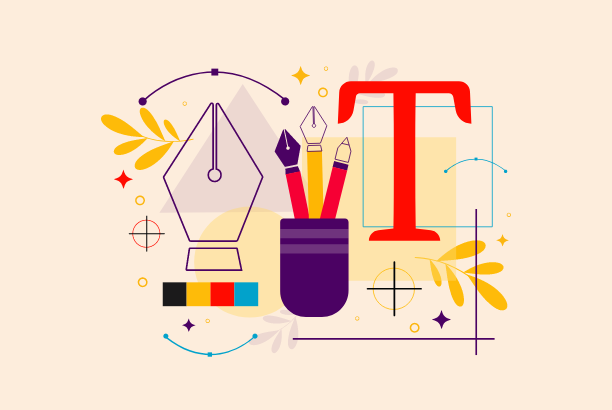
Let’s learn about fonts. Fonts are like air in design. You won’t notice it unless there’s something wrong with it. And when there is something wrong, it quite messes up everything! There are more than half a million fonts available in the world, but we graphic designers use only a handful of popular fonts! I know you are thinking of Montserrat! Fonts are also a part of visual elements. So, they can be used as psychological elements to drive your audience towards a particular message.
We need to learn about available fonts and which type of font gives what sort of message. Before we dig into that, let’s understand the essentials of fonts.
Why Do Fonts Matter?
Picking a font for your design is not just about selecting whatever typeface you want. You cannot think like, “Oh! This font looks cute. Gonna select this one.” That’s a red flag in font selection. You have to understand what message you are trying to deliver with your design and select fonts accordingly. Still not clear? Just look at the example below.

I believe now you are clear why fonts actually matter! Furthermore, an excellent selection of fonts can create a solid visual hierarchy, complement the graphical balance, and be the centerpiece of the design. A good set of fonts can help you with –
- Delivering clear communication towards your audience.
- Setting the tone & voice of your design.
- Helping you build a brand identity.
- Delegating emotional impact to the audience.
- Giving proper hierarchy and readability in the design.
Therefore, using the proper font in your design is very crucial. It not only tells the story upfront but also develops an emotional connection with your audience.
Psychological Factors of Major Font Styles
Back in 1989, a research study by The British Psychological Society found a correlation between adjectives and various fonts. The subjects were shown multiple types of fonts and asked about their qualities like heavy, light, fast, slow, etc. From the study, it was found that Times New Roman was seen as “formal” and Helvetica as “legible”. This gives us an idea about our perception of fonts. Times New Roman is a “Serif” font & Helvetica is a “Sans-serif” font.
Let’s have a broader look at what kinds of fonts are available & what message they deliver.
Serif
Serif fonts can be marked as traditional or old-school categories. These typefaces are famous for their classic look, which makes them very respectable. Modern Serif fonts are more about luxury and elegance. Almost in every luxury brand, you’ll see the use of serif fonts.

Some examples include Times New Roman, Garamond, Georgia, and Palatino.
Sans-Serif
Sans-serif fonts directly refer to fonts without serifs. Therefore, these fonts can be efficiently used in digital devices or digital typing for their modern look. Sans-serif fonts are easy to read for their cleanliness and clarity. That’s why you’ll find it very efficient to use sans-serif fonts in any modern design.

Some popular sans-serif fonts are Arial, Helvetica, Montserrat, Futura, and Calibri.
Script
These are mostly creative looking calligraphy type fonts. These are perfect for displaying any unique portion of the design or to give a personalized look in the design. Since these fonts look more like calligraphy art, there is a vast number of distinctive fonts you can choose from. These fonts will help you give an emotional touch in the design which might connect with the audience.

Some examples of script fonts are Alex Brush, Amsterdam, Pacifico, Lobster, and Tangerine.
Decorative
These fonts are uniquely created & most commonly used as display fonts. You cannot put them as body text as they are not so readable. But their unique shape & look is what makes them different. It can be helpful to draw your audience’s attention when you are using such display fonts.

Some common decorative fonts are Phosphate, Chalkduster, Graffiti, Grunge, and Stencil.
A simple way to make readers look at important words, sentences, or parts of your text is by highlighting them. You can make the text bold, which makes the letters thicker and grabs attention. Other common methods include using Italics, Underline, or Strikethrough. Sometimes, changing the font style or size can also help highlight certain information.
Some fonts have special styles for emphasis, like Helvetica Bold or Times New Roman Italic. But nowadays, with modern writing and website-building tools, it’s easy to add these emphasis effects without needing to switch fonts, thanks to simple commands.