For too long, the design world played it safe. Neutral tones and minimalist palettes ruled the roost, creating a landscape that felt, well, a bit bland. But a vibrant revolution is underway! Bold and electrifying colors are bursting onto the scene, injecting energy, personality, and a sense of joyful abandon into everything from websites and branding to product packaging and graphic design.
Why the Sudden Splash of Color?
The rise of vibrant colors can be attributed to several factors:
- Digital Natives Take Charge: Gen Z, a generation raised on digital stimulation and unafraid of self-expression, is entering the design workforce and consumer base. Their love for bold visuals and playful aesthetics is making waves.
- Attention in an Oversaturated World: In today’s information overload, standing out is crucial. Bold colors grab attention, making a lasting impression on viewers who are bombarded with visual stimuli on a daily basis.
- Emotional Connection: Colors have the power to evoke emotions. Vibrant palettes can create a sense of happiness, excitement, and optimism – feelings people crave in an increasingly complex world.
- Technological Advancements: Technological advancements in printing and display capabilities allow designers to use a wider range of colors with greater accuracy and vibrancy than ever before.
How are Bold Colors Making a Statement?
The beauty of this trend lies in its versatility. Bold colors are being used in a variety of ways:
- Monochrome Magic: Embrace a single, bold color for a striking and visually cohesive look. This approach is particularly effective for websites and branding that want to make a strong statement.
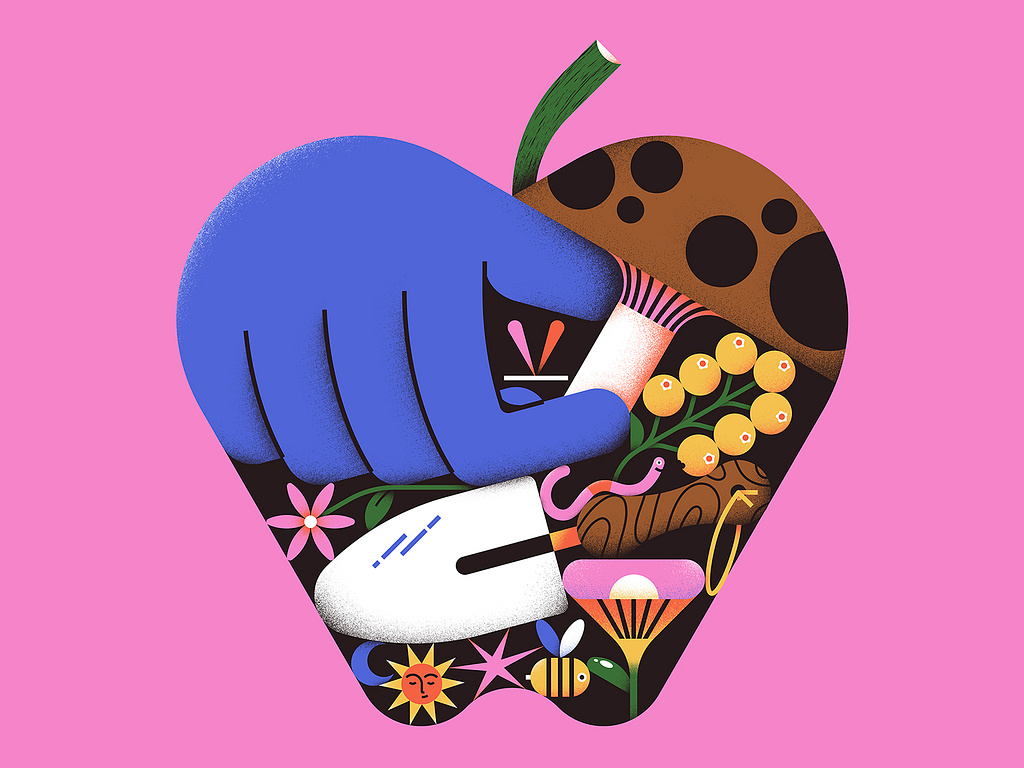
- Color Blocking: Juxtapose contrasting colors for a high-impact effect. Imagine a website with a royal blue background and bursts of fiery orange for calls to action.
- Gradient Delights: Create a sense of depth and dynamism with gradient color schemes. Think sunset hues transitioning seamlessly or a cool blue fading into a vibrant green.
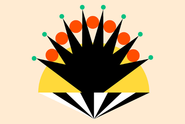
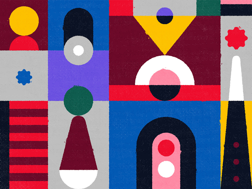
- Retro Revival: Channel the energy of past decades with bold color palettes reminiscent of pop art or Memphis design. Geometric shapes and playful patterns complement this style perfectly.
Beyond Aesthetics: The Power of Color Psychology
The key to using bold colors effectively lies in understanding color psychology. Consider the emotions you want to evoke with your design. Red exudes energy and passion, while blue evokes trust and calmness. Using color strategically allows you to guide the viewer’s experience and create a lasting impact.
A Trend with Staying Power
The dominance of bold and vibrant colors isn’t a passing fad. It reflects a societal shift towards self-expression and a desire for visual experiences that are stimulating and engaging. As technology continues to evolve and Gen Z’s influence grows, expect to see even bolder and more innovative uses of color in the design world. So, ditch the beige and embrace the rainbow! Your creations will be all the brighter for it.